|
INTRODUCTION:
As the
'rampant morbid obesity'
epidemic spreads over the USA in the 1960-to-2010-plus time frame,
reports are getting more frequent about how the increase in
the average age of death (which seemed to be a quite robust
increase in the 1900 to 1980 time frame) seems to be leveling off
--- both for men and for women.
In other words,
'life expectancy' in the USA seems to be leveling off.
In fact, in some localities (in some counties in the USA), the average
age of death has shown some decreases --- in the 2010 to 2015 time frame.
It seems that the beneficial effects in the USA of
- screen (and glass) doors and screen (and glass) windows
- draining swamps in human-populated areas
- indoor plumbing and better sewage systems
- better water systems
- better food quality
- better and more-readily-available medicines (anti-bacterials etc.)
- better drainage and paved roads and sidewalks
- less horse poop in the streets
- etc.
(especially in the 1900 to 1970 time frame)
have done their best to improve life expectancy and, now,
cannot overcome the effects of 'rampant morbid obesity'.
As I scan the obituaries in a newspaper (
the Daily Press ) --- which is a newspaper
for 'the Peninsula area' (between the James and York Rivers ---
especially covering news for the cities of Newport News and Hampton)
in the
Hampton Roads area of Virginia, I have wondered if a decline
in the average-age-of-death will be showing up in data collected
from those obituaries.
Also, I wonder what the
'distribution profile' of deaths will look like ---
over the coming years --- on 'number-of-deaths versus age' plots
--- say, for each year.
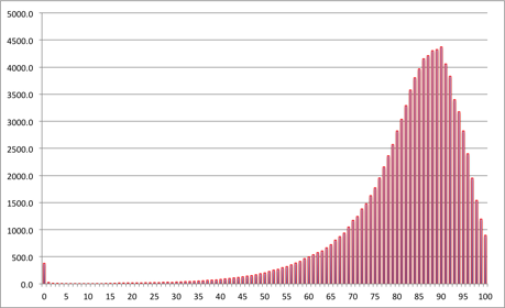
A sample 'distribution profile' plot is shown at the top of this page.
I would expect the plots for 'the Peninsula' area to exhibit the
same general shape.
Deaths-versus-Age Data Collection:
I decided to collect data from Daily Press obituaries --- to show
tables (and eventually plots) of number-of-deaths versus age ---
for men and for women --- and for various years.
Most deaths occur between the ages of 50 and 100, and it seems that
on the order of 4 deaths (or more) at each of the years in this range
would be needed to get a fairly good idea of the 'real'
'deaths-versus-age distribution'.
So it appears that about 4-times-50,
or at least 200 data points (deaths), would be needed for each year to
get a fairly good idea of 'the distribution' for the year --- at least
200 data points for men and another 200 for women.
Another criterion for judging when sufficient data is collected:
When the highest peak in the collected data exceeds a count of
about 20 deaths (for the age/year at that peak), then we will probably
be getting to the point of having enough data to generate a
reasonably meaningful data plot (death-count versus age-in-years).
It seems that about 5 to 20 deaths (daily) are being reported in the
Daily Press obituaries each year --- say an average of about 10 per day.
Then, given 365 days in the year, it seems that about 3,600 'data points'
is the maximum one can expect from the Peninsula obituaries.
Collecting somewhere between 200 and 1,800 data points
(for men or for women) probably would be a reasonable number to collect
to get some meaningful plots for a given year.
Some notes on the data collected :
The number of infant deaths are probably under-reported in the
Daily Press obituaries. In fact, it seems that they are very seldom
reported.
There are some weeks for which I may not collect data from the
obituaries --- because I did not get obituary pages for some weeks
of the year.
Data for people under the age of 40 may be under-reported in the
Daily Press obituaries.
Some obituaries do not give the age at death (neither directly nor
by giving the birth date of the deceased).
For these reasons (and others), the data tables (and eventual plots)
are not meant to be 'comprehensive'.
These tables mainly are meant to satisfy my curiosity --- and perhaps
answer questions like 'Is the obesity epidemic having a
significant effect on life expectancy --- and on actuarial tables?'.
Plotting the data:
I intend to use the tables of data (in the web page links below) to
plot the 'deaths-versus-age' distribution curves.
I will probably use
LibreOffice Calc to provide spreadsheets (with plots) of the
data for the years below.
And, for some years,
I may use the plot-from-columns-of-data utility ('free' = no-cost)
--- which is described on a Freedom Environment (www.freedomenv.com)
'PLOTtools' page.
Enough of this 'Introduction'.
Here is a 'Table of Contents' which provides links (by year) to
'deaths-versus-age distribution' data tables --- and (eventually) to
associated data plots . . . 'distribution' plots.
|